Human curiosity is behind all innovation. The internet began as a place to share and evolved into a place to discover. Over time, the exchange of personal data for access has left people vulnerable, as big tech prioritized data mining over discovery, retention over engagement, and targeting over personalization. Enter Canopy, led by the scientist who created Spotify's recommendation engine. We collaborated with Canopy's founding team on positioning, voice, and visual identity to attract and align the smartest investors, engineers, operations, and product people around a better way. Canopy's vision is a new infrastructure where sights, sounds, and stories align with your natural curiosities, without the cost of privacy.
Strategy
Build adoption in waves.
Explaining a new idea is the first step of making it real—especially when the idea is complex, abstract and revolutionary. Clear positioning and voice align investors and early collaborators around a common goal. From there, each brand touch point, from avatar to UI experience, expresses core values to attract and delight early adopters.
Solution
Keep people first.
Canopy exists to change the conversation on privacy. Their first launch, an app named Tonic, recommends new personalized content every day, without logins, accounts, information or behaviors ever leaving your phone. Canopy never sees your data, nor does any content provider or partner they work with. From the app model, Canopy will build recommendation engines that can scale—ethically—as consumers demand privacy.
Make the abstract trustworthy.
Canopy's technology uses on-device machine learning with differential privacy—it understands patterns of things you are curious about, then finds adjacent interests and brings them to you. Simply put, Canopy leaves what it finds in your hands, without leaving traces of you wherever searched.
Celebrate exploration.
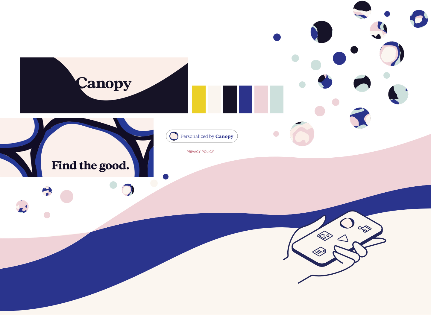
Canopy believes that identity is intimate and personal, and most importantly, not their business. We designed the brand system to reflect the core idea of safe discovery. Users are invited to explore through the visual analogy of a forest canopy: a protective layer that covers and reveals, organically. Positioning is built around trust, transparency, and a better way.
For digital explorers, Canopy is a new way to discover the sights, sounds, and stories that inspire your life, without compromise.
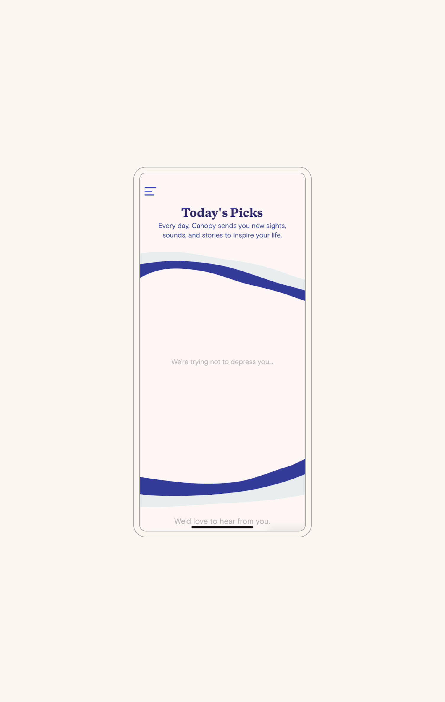
The voice of Canopy is more emotional than robotically logical, with a quick laugh and ease of explaining complex things. This curious, frank, and knowledgeable voice found its way into micro-copy on loading screens to surprise and resonate with individual users.
This is personal.
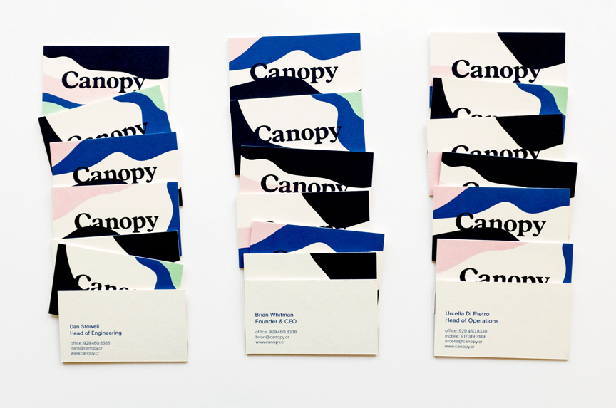
Canopy’s team is made of experts who built much of the personalization layer in use today on the internet. Now they're working to make it better and more secure. As the sole stationery element for the brand, business cards celebrate each person’s unique perspectives, with a tactile heft that nods to the seriousness of the job at hand.

I had to create a brand and a story before I had the technology we’re creating. The whole point of the company is we’re trying to make these bigger societal changes. I needed someone to help me tell that story, as the tool was being built. I knew Language Dept. was capable of grasping those ideas, understanding the importance and articulating it in a way that everyone could get on board.
Urcella DiPietro,
Head of Operations, Canopy
Results
Scope
- Stakeholder Interviews & Workshops
- Persona Development
- Audience & Landscape Research
- Insights & Positioning
- Identity System
- Voice & Messaging
- Web & Mobile Design
- Motion Graphics & Animation
Team
- Sarah Asip, Identity Design & Research
- Jenn Cash, Principal, UX Strategy & Creative Direction
- Jesse Lankford, Strategy and Visual Design
- Tanya Quick, Principal, Brand Strategy & Creative Direction
- Rachel Shim, Motion Design & Research
- Niquita Taliaferro, Strategy, UI & Visual Design
- Frank Wild, Studio Assistant
Collaborators
- Caroll Taveras, Team Portraits
